Data Science · Case study · 2026
Mapping transit deserts in Île-de-France
Île-de-France has 1,297 communes served by 75 transit operators — yet behind that density, some towns are still out of comfortable reach of public transport. This case study quantifies that gap: building a composite mobility score from open GTFS and INSEE data, then isolating the towns where the policy question is sharpest.
01
The problem
Île-de-France is an extraordinarily dense transport region — 1,297 communes, 75 operators, hundreds of train, metro, tram and bus lines. But aggregate density hides local reality. In some communes, the nearest stop is a long walk, frequency is thin, and a car is still the daily default. These are the transit deserts: not zero coverage, but coverage too weak to be a real alternative.
The policy question is harder than it looks. Public transit investment is finite, so the relevant target isn't every under-served pixel — it's communes where enough people live with too little service. This project frames that question quantitatively and produces a short, actionable list.
02
The data
Four open data sources, all stitched at the commune level:
| Dataset | Source | Format |
|---|---|---|
| Transit timetables and stops | Île-de-France Mobilités via transport.data.gouv.fr | GTFS |
| Population by commune | INSEE via geo.api.gouv.fr | JSON |
| Commune boundaries | france-geojson | GeoJSON |
| Bike-share docks | Vélib' Métropole (Smovengo) | GBFS |
A small but instructive data pitfall: INSEE's default API returns Paris as one single commune (75056), while france-geojson splits Paris into its 20 arrondissements (75101-75120). Joining naively would silently drop Paris from the map. Fix: hit INSEE's arrondissement endpoint as a second pass and concatenate.
03
From timetables to a usable grid
GTFS data ships as raw schedules: thousands of stops, hundreds of routes, millions of timetabled departures. To turn that into per-commune accessibility, the pipeline lays a regular 500-meter grid over the region and, for each grid cell, computes the distance to the nearest transit stop.
Naive distance-to-each-stop would be O(cells × stops) — too slow at this scale. The solution is a SciPy cKDTree built on stop coordinates: O(cells × log(stops)) lookups, sub-second on the full region. Cell-level distances are then aggregated up to commune level (mean distance to nearest stop), along with daily passages (summed) and the count of distinct transport modes served.
04
A composite mobility score
Three signals matter for whether transit is a real option: how close a stop is, how often something passes, and how many modes are available. They are blended into a single 0-100 score:
mobility_score = 0.40 × (1 − normalized_distance_to_stop)
               + 0.40 × log(normalized_daily_passages)
               + 0.20 × normalized_modal_diversity
Each component is min-max normalized to [0, 1] before weighting, and the final result is scaled to [0, 100]. Two design choices stand out:
- Log-transform on frequency. Without it, hubs like Châtelet (≈10,000 passages/day) would flatten every other commune to near zero. The log makes the score sensitive at the low end, where the policy question lives.
- 40/40/20 weights. Distance and frequency get equal weight (both equally veto a line as a real option); modal diversity matters but is the weakest single signal — a single high-frequency train station often beats five poorly-served bus stops.
05
Distribution across the region
Applied to all 1,297 communes, the score gives a clear regional picture: a strong central mass around 45-55, a long right tail of well-served urban communes, and a thin left tail of severely under-served towns.
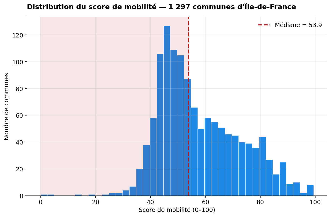
The regional median (53.9) becomes the natural cut-off for what counts as “below average”.
06
Identifying priority transit deserts
A low score alone doesn't make a public policy priority — a village of 200 with no train is a different problem from a town of 10,000 with no train. The definition combines scale and deficit:
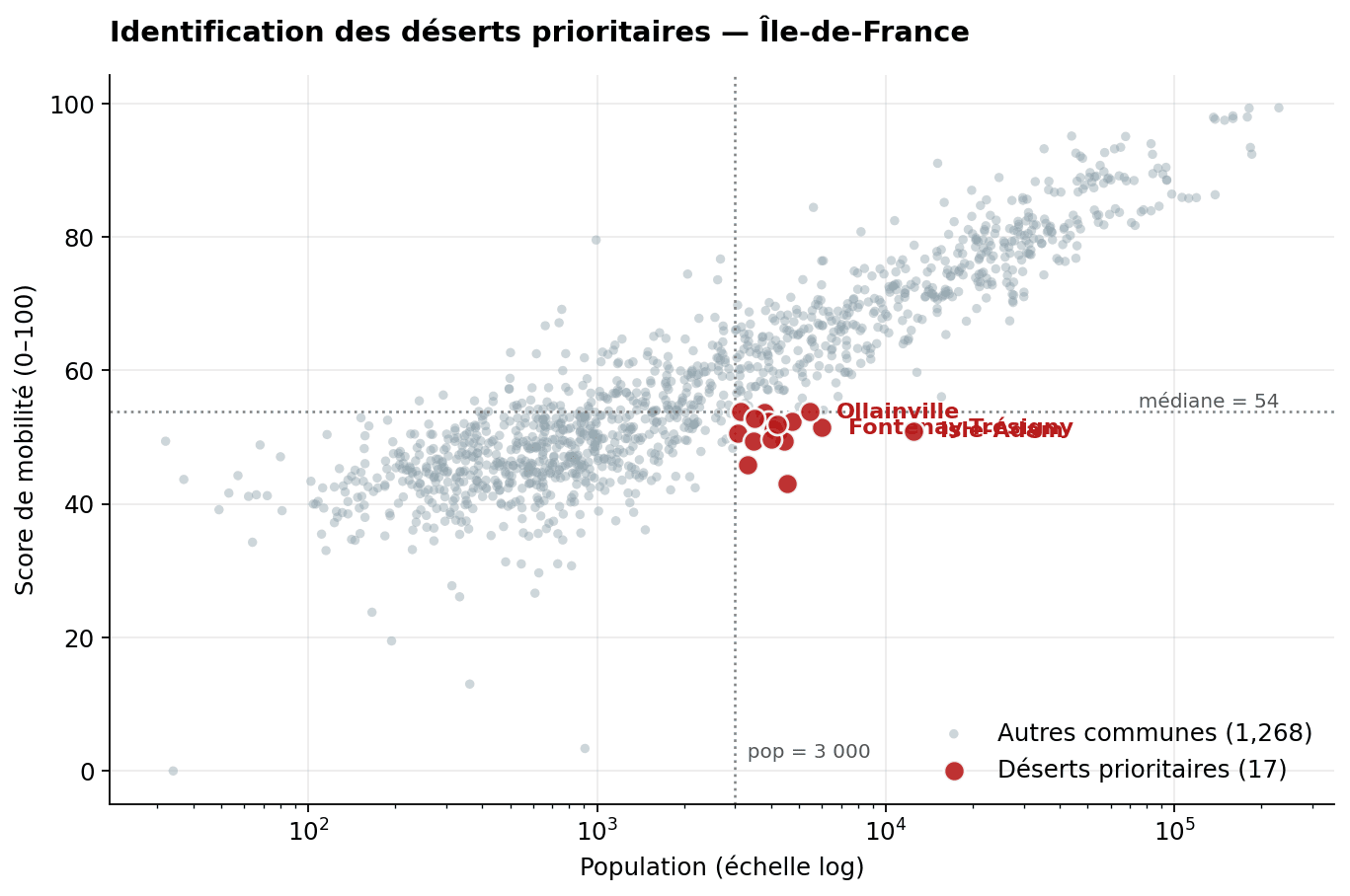
Priority transit desert = commune with ≥ 3,000 inhabitants AND mobility score ≤ regional median (53.9).
Plotting population (log scale) against score makes the filter visual — only the bottom-right quadrant qualifies:
07
Where they are
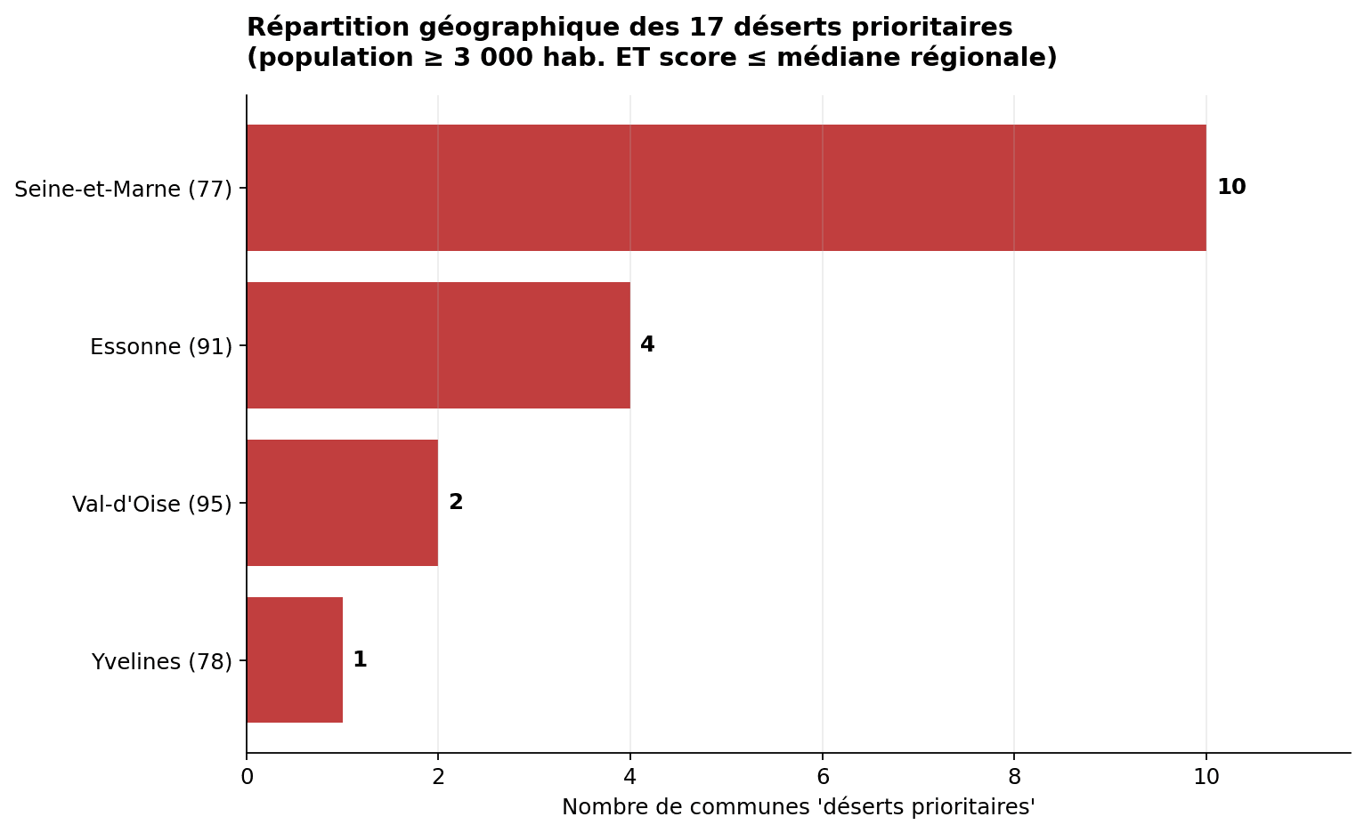
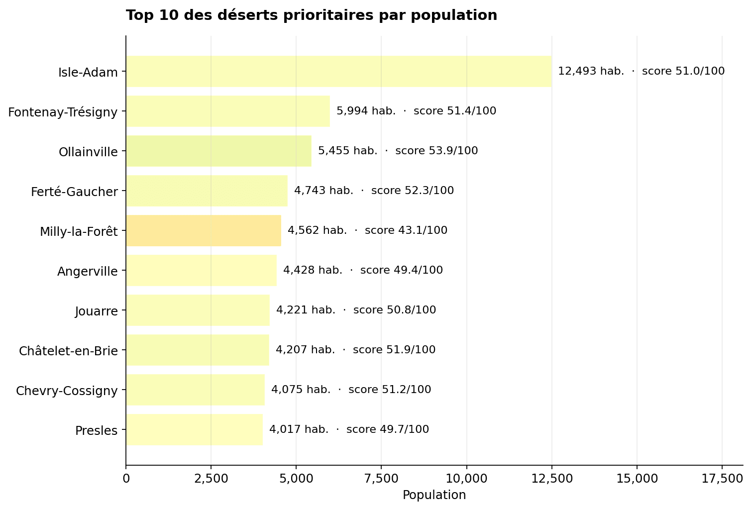
The 17 priority deserts aren't scattered randomly. They concentrate in three departments that share one structural feature: no direct heavy-rail backbone.
08
The pipeline and the interactive map
The end-to-end pipeline is four numbered scripts, runnable in order from a clean checkout — no proprietary GIS software (no ArcGIS, no QGIS):
src/
├── 01_transit_network.py    GTFS ingestion + stop mapping by mode
├── 02_accessibility_grid.py 500m grid, nearest-stop via cKDTree, commune aggregation
├── 03_mobility_score.py     Composite score + priority deserts
└── 04_dashboard.py          Interactive Folium dashboard
The output is a Folium-based interactive map: choropleth of the mobility score over commune boundaries, transit stops overlaid by mode, and the priority deserts called out by name. Try it inline below — pan around the region and click any commune for its raw score components.
09
Takeaways
| Step | Skill demonstrated |
|---|---|
| Ingesting GTFS + INSEE + GeoJSON + GBFS | Real-world open-data plumbing, with the Paris arrondissement gotcha caught |
| 500m grid + cKDTree nearest-stop | Spatial scaling beyond a naive O(n²) |
| Composite score with log-transform | Score design with explicit policy intent |
| Threshold rule (population × median) | Translating an analytical question into a decision rule |
| Folium interactive map + GitHub Pages | Shipping the work to a non-technical reader |
| 100% open-source stack | Reproducibility — anyone with Python can run the whole pipeline |
What I take away: the hardest part of this kind of work isn't the geospatial code — it's deciding what counts as “a problem worth flagging”. The 40/40/20 weights and the (population × median) cut-off are opinions, not facts. Stating them clearly is what turns an analysis into a decision tool.