Data Science · Case study · 2026
Predicting employee attrition
A retention model for 1,470 employees, and an honest account of what it can and cannot be used for. A penalised logistic regression separates leavers from stayers at a hold-out AUC-ROC of 0.808 — but the most useful output of the project is the fairness audit, which measures why it should not be deployed as an individual scoring system.
01
The problem, restated
The brief looks like a classification exercise: 1,470 employees, 237 of whom left, predict the rest. Taken literally it produces something worthless. At a 16.1% base rate, a model that answers “nobody ever leaves” scores 83.9% accuracy while never once identifying the thing it was built to find.
The useful brief is different. An HR team has finite capacity for retention conversations, so what it needs is a ranked watch-list sized to that capacity, an explanation a manager can act on, and — because this is a model about people, run by their employer — an account of who it fails. This case study is organised around those three, in that order.
02
A dataset that is clean in a suspicious way
The audit found no missing cells in 51,450, no duplicates, no impossible values. That cleanliness is itself worth being wary of — it is a synthetic teaching set, and the artefacts show.
| Check | Result | Action |
|---|---|---|
| Missing / duplicate | 0 of 51,450 cells, 0 duplicate rows | none needed |
| Zero-variance columns | EmployeeCount, StandardHours, Over18 | dropped — no information |
| Identifier | EmployeeNumber unique per row | dropped — leakage risk |
| Collinear pairs (|r| > 0.7) | JobLevel↔MonthlyIncome r=0.95; the three Years* fields r≈0.71–0.77 | kept — see below |
Four variables dropped, 30 predictors left. The collinear pairs were kept deliberately: a penalised model handles them without instability, and dropping one of JobLevel / MonthlyIncome would discard a real distinction — a level-2 employee paid badly for level 2 is not the same person as a well-paid one. The cost is that SHAP splits credit between correlated partners, and section 07 pays that bill in full rather than hiding it.
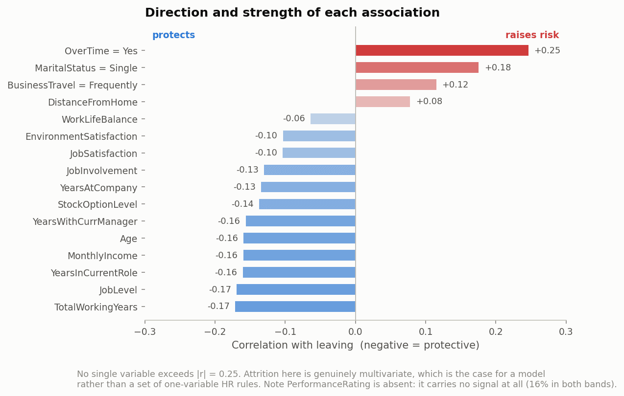
Two things no automated check catches. PerformanceRating takes only the values 3 and 4, with attrition at 16% in both bands — the variable is inert, which is itself the finding: whatever this company measures as performance has no relationship to who leaves. And DailyRate, HourlyRate and MonthlyRate correlate with nothing, including salary. They behave like noise fields. They were kept rather than dropped on a hunch, so the model could be asked what it made of them.
03
What the EDA gives you — and what it doesn't
Overtime is the strongest single signal in the data: 30.5% of those who work it leave, against 10.4% who do not. But the headline hides the shape.
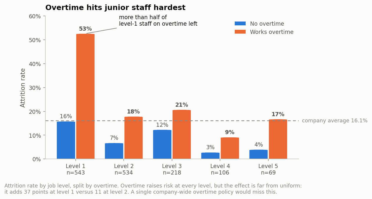
The rest of the exploration points the same way and never any further: the bottom two income deciles both lose 31% of their staff while the middle of the payroll sits between 9% and 18%; 35% of first-year employees leave and 21% in year two; every satisfaction item leans in the same direction and none is dramatic on its own.
04
Class imbalance, tested rather than assumed
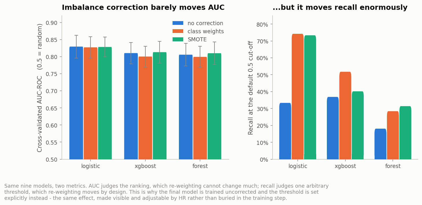
The reflex at a 16% base rate is to reach for class weights or SMOTE. Instead, three strategies (none, class weights, SMOTE) were crossed with three model families and scored with 5-fold CV repeated three times, on the training set only. SMOTE is fitted inside the cross-validation pipeline — fitting it beforehand would let synthetic points interpolated from validation-fold rows leak into training and inflate every score.
| CV AUC | no correction | class weights | SMOTE |
|---|---|---|---|
| logistic | 0.829 | 0.827 | 0.828 |
| xgboost | 0.810 | 0.800 | 0.813 |
| forest | 0.806 | 0.799 | 0.810 |
Imbalance correction does essentially nothing to AUC. What it moves, enormously, is recall at the default 0.5 cut-off: for the logistic model, from 33% uncorrected to 74% with class weights. The two facts are the same fact. AUC judges the ranking of employees by risk, which re-weighting cannot change much; recall judges one arbitrary threshold, which re-weighting moves by design.
So the decision follows from the evidence rather than the reflex: train uncorrected, then set the threshold explicitly. Same recall, but as a visible dial HR can turn against its own capacity rather than a side effect buried in the training step. SMOTE was rejected on a second ground too — it interpolates between one-hot columns, producing synthetic employees who are 0.4 of a Sales Representative.
05
Choosing a model, and leaving the hold-out standing
Four families were trained — a stratified dummy as a floor, logistic regression, random forest, XGBoost — each given the same 40-draw randomised search. Tuning only the CV leader would have let the winner be decided by which model happened to get a search budget.
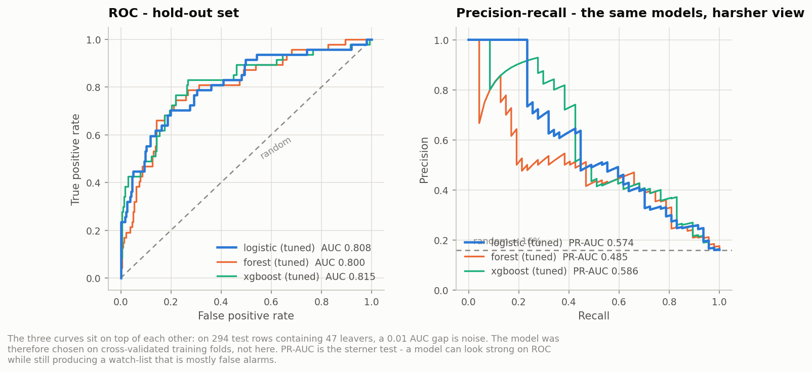
The selection rule was fixed before the hold-out was touched: highest CV AUC wins; if the top two are within one fold standard deviation they are treated as tied on ranking power and the tie goes to the better-calibrated model. On training folds the logistic regression led on all four columns — AUC 0.8366 ±0.030, PR-AUC 0.642, Brier 0.092, log-loss 0.326 — against 0.8285 for XGBoost and 0.8127 for the forest, with the dummy at 0.496.
| hold-out | AUC-ROC | PR-AUC | Brier |
|---|---|---|---|
| logistic (tuned) — champion | 0.808 | 0.574 | 0.101 |
| xgboost (tuned) | 0.815 | 0.586 | 0.098 |
| forest (tuned) | 0.800 | 0.485 | 0.111 |
The hold-out reverses the ranking, and it is left standing rather than tidied away. On 294 rows containing 47 leavers, a 0.006 AUC gap is noise. The honest conclusion is that the logistic regression and the gradient-boosted model are indistinguishable on this data, and the pre-committed rule picks the logistic. That the simpler, fully transparent model matches a boosted ensemble is the expected result on 1,470 rows with no strong interactions — and it is a real advantage for a model whose output has to be defended to a works council.
06
From a score to a capacity plan
A retention conversation costs manager time, so the operating point is a capacity, not a probability. The question is not “who will leave” but “how many names can we act on this quarter, and what do those names buy us”.
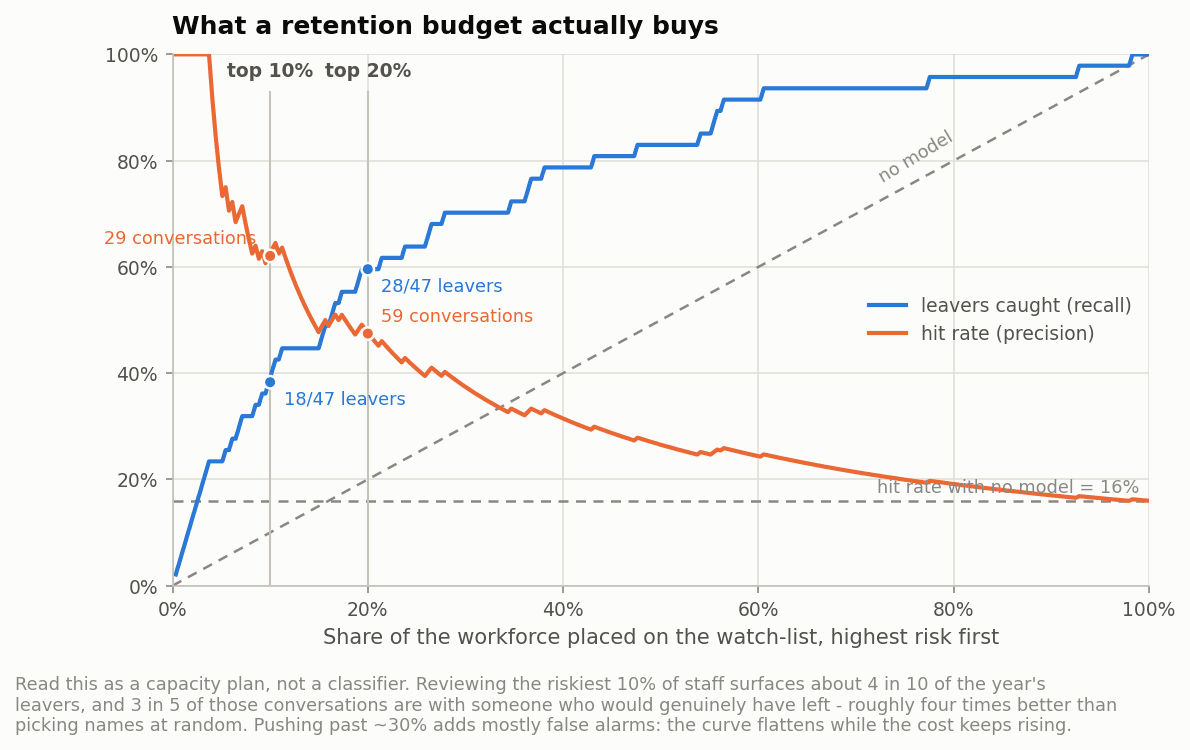
| watch-list | conversations | leavers caught | hit rate | lift |
|---|---|---|---|---|
| top 5% | 15 | 11 of 47 (23%) | 73% | 4.6× |
| top 10% | 29 | 18 of 47 (38%) | 62% | 3.9× |
| top 20% | 59 | 28 of 47 (60%) | 48% | 3.0× |
| top 30% | 88 | 33 of 47 (70%) | 38% | 2.4× |
The recommended point is top 10%: 29 conversations surface 38% of the year's leavers at a 62% hit rate, roughly four times better than picking names at random. The F2-optimal threshold (0.098, weighting recall twice precision) catches 79% of leavers — but flags 38% of the workforce to do it, and two thirds of those names are false alarms. That is not a rounding error in a metric, it is 75 people wrongly marked as flight risks in a system their manager can see, and it is why the F2 point was refused.
The champion's Brier score of 0.101 matters here for a practical reason: the scores survive being read as probabilities, which is what makes them safe in front of a manager who will inevitably read “62%” literally.
07
Explainability, with its own caveat
SHAP values for the champion are exact and deterministic: with feature_perturbation="interventional", a linear model's SHAP value reduces to coef · (x − E[x]), so there is no sampling and the figures reproduce bit-for-bit. The alternative correlation_dependent mode was tried first and its top-ten ranking visibly reshuffled between runs. Determinism was preferred — and the bill for that choice is paid two paragraphs below.
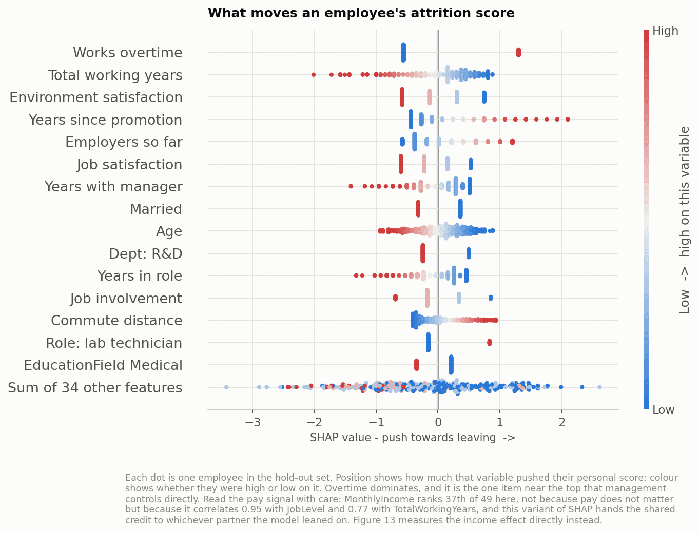
Read the pay row with suspicion, not satisfaction. MonthlyIncome ranks 37th of 49 at 0.068 — which does not mean pay is irrelevant, since the EDA showed 31% attrition in the bottom two deciles. It means this SHAP variant assigns shared credit to one partner, and income correlates 0.95 with JobLevel and 0.77 with TotalWorkingYears. The compensation signal is spread across those columns. This is the concrete cost of the collinearity decision made in section 02, and it is why section 08 measures income directly instead of trusting this ranking.
The HR reading. Almost everything at the top of this chart is structural — total experience, time since promotion, number of previous employers, tenure with the current manager. A manager cannot change how many employers someone has had. What is left is short: workload and the three satisfaction items (0.436 + 0.378 + 0.318 = 1.13 jointly). A short actionable list is a more useful output than a long inert one.
One oddity worth stating: of the three suspected noise fields, HourlyRate (0.006) and MonthlyRate (0.012) are indeed inert — but DailyRate picks up 0.160. There is no plausible mechanism for that. A model will happily assign weight to noise, which is a reason not to read the middle of any importance ranking as if every row meant something.
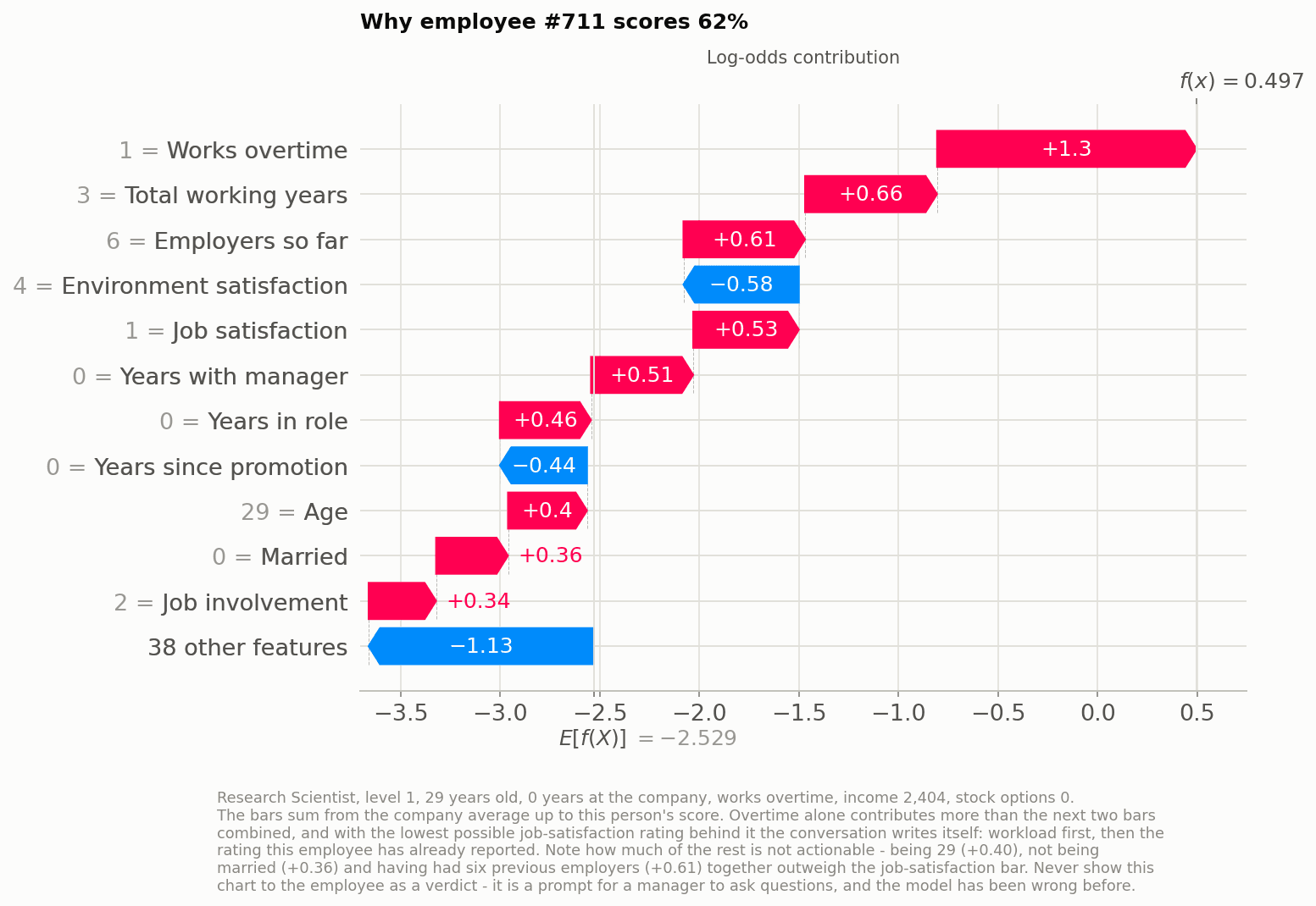
The bars are a conversation agenda in priority order: workload (+1.30), then the job-satisfaction rating of 1 they have already reported (+0.53), then a first year with no vesting and no relationship with a manager yet (+0.51). All three are addressable, and none of them needed a model to be discovered — what the model adds is the aggregation, and the ranking of this person against 1,469 colleagues.
What the chart shows that cannot be acted on. Being 29 (+0.40), not being married (+0.36) and having had six previous employers (+0.61) together outweigh the job-satisfaction bar. A manager handed this without guidance may quietly conclude that young unmarried job-movers are a bad hire. That is a discrimination risk created by the explanation, not by the prediction — the score would be just as accurate without ever showing those three rows — and it is a direct argument for exposing only the actionable subset of bars.
08
Where the model corrects the analyst
Two findings in this project only exist because a model was fitted. Both contradict a reading that a competent analyst would have taken from the cross-tabs.
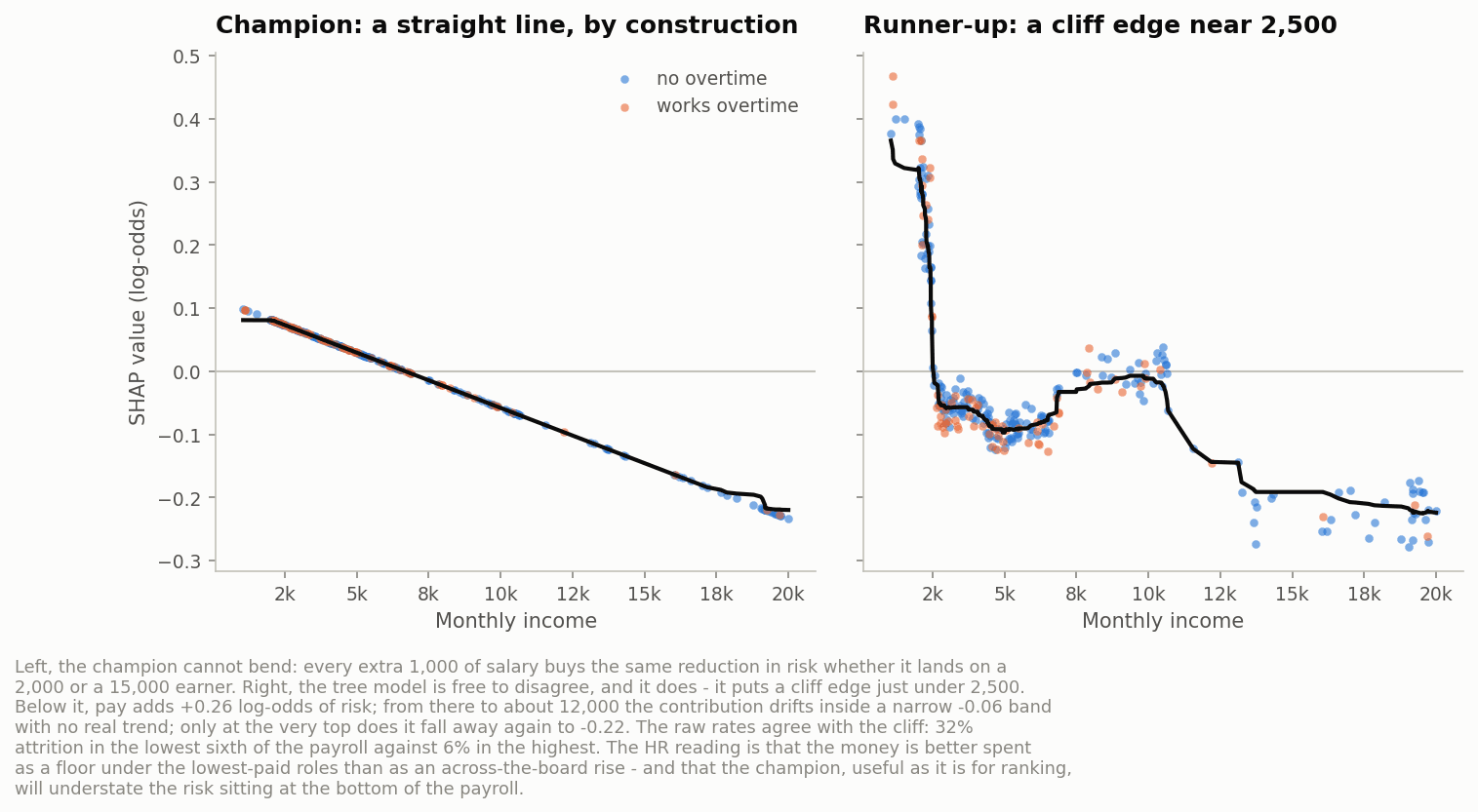
Below that cliff, income contributes +0.27 log-odds of attrition risk. From there to about 12,000 the contribution drifts within a narrow −0.06 band with no real trend, falling away again only at the very top. The raw rates agree: 31% attrition in each of the bottom two deciles, 9–18% across the middle, 3% at the top.
The budget recommendation. Retention money buys far more as a floor under the lowest-paid roles than as an across-the-board rise: between roughly 2,500 and 12,000 a month, pay is simply not what is driving people out. The secondary lesson is a caution about the champion itself — being linear, it will systematically understate the risk concentrated at the bottom of the payroll, and anyone using its scores should know that.
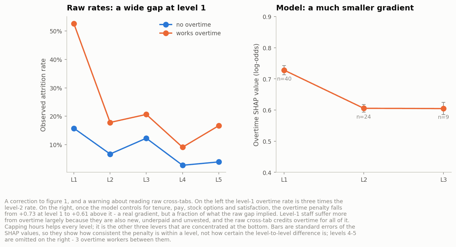
Level-1 staff suffer more from overtime largely because they are also new, underpaid and unvested, and the cross-tab credits overtime with all of it. The practical consequence is direct: capping hours helps every level roughly equally; it is the other three levers that are genuinely concentrated at the bottom. An analyst reading the first chart alone would have mis-targeted the intervention.
09
The audit that changes the recommendation
A per-group audit was run on the hold-out. The most serious finding is not the one fairness reviews usually look for.
| age band | n | flagged | actual attrition | recall | AUC |
|---|---|---|---|---|---|
| 18–30 | 77 | 53.2% | 23.4% | 88.9% | 0.843 |
| 31–40 | 126 | 42.1% | 11.1% | 92.9% | 0.882 |
| 41–50 | 63 | 23.8% | 14.3% | 77.8% | 0.854 |
| 51–60 | 28 | 10.7% | 21.4% | 16.7% | 0.636 |
The model discriminates by age — against the people it fails to help. Employees aged 51–60 leave at 21.4%, nearly the rate of the under-30s, yet the model flags only 10.7% of them and catches 1 of their 6 leavers. Its AUC in that group collapses to 0.636 and the selection-rate ratio across bands is 0.20, far below the 0.8 rule of thumb. The harm here is not being wrongly flagged; it is being invisible — older employees at genuine risk receive none of the retention attention the system directs. (Caveat: 28 people, 6 leavers. The direction is clear, the magnitude is not — and this is precisely the group the data is too thin to serve, which is itself the finding.)
Gender looks acceptable on the number most audits report — a flag ratio of 0.96 — and that number is exactly the one that hides the problem. The model's AUC is 0.754 for women against 0.835 for men: a measurably weaker instrument for 40% of the workforce. Marital status carries more attributed score (6.2%) than age and gender combined, with single employees flagged at 52.6% against 26.6% for divorced ones.
The obvious fix does not work. Retraining without Age, Gender and MaritalStatus costs only 0.003 AUC — the information survives in proxies (tenure, job level, income, commute), so the model reconstructs it while the audit trail disappears. Removing protected attributes would make this system less fair and harder to challenge, not more fair. The defensible choice is to keep them visible and audit by group. Marital status is the one I would nonetheless drop: small predictive contribution, hardest of the three to justify to an employee.
A separate problem is consent. The satisfaction and work-life balance items are the model's strongest controllable predictors, and employees answered them believing the responses were confidential and aggregate. Feeding them into an individual flight-risk score is a change of purpose they never agreed to, it is exposed under GDPR Article 22, and it is self-defeating: once staff work out that survey answers feed a scoring system, the answers stop being truthful and the best features in the model decay.
What I would require before deployment. Aggregate reporting only in the first cycle — team- and role-level risk, no individual names. Individual scores released only with a works-council agreement, an appeal route, and an explicit ban on their use in promotion, assignment or termination decisions. Quarterly re-audit of the table above, with the 51–60 band as a blocking condition. And a prospective evaluation: score one quarter, act on nothing, measure. Everything here comes from a single 294-row hold-out.
The failure mode this guards against is not a bad prediction. It is a manager quietly writing off a “high-risk” employee — excluding them from a long project, passing them over for development — until the model becomes correct by causing what it predicted. Standard accuracy monitoring cannot detect that, because a self-fulfilling flag looks exactly like a good call.
10
Takeaways
| Decision | Skill demonstrated |
|---|---|
| Testing three imbalance strategies instead of reflexively applying SMOTE | Separating what a metric measures (ranking) from what a threshold measures |
| Fixing the selection rule before touching the hold-out | Pre-registration discipline — and reporting the reversal rather than hiding it |
| Reporting a capacity table, not a confusion matrix | Translating a probability into an operating decision a team can staff |
| Choosing deterministic SHAP and stating what it costs | Knowing the assumptions inside the explainability tool, not just its API |
| Auditing by group and finding the 51–60 blind spot | Fairness as measurement rather than as a paragraph of good intentions |
| Recommending against individual deployment | Judging when a working model should not ship as built |
What I take away: the modelling was the short part. AUC 0.808 was reachable in an afternoon, and the gap between the three families was never resolvable at this sample size. The work that changed the recommendation was everything after — the capacity table, the collinearity bill, the group audit. The single finding I would defend without further evidence is narrow and useful: overtime, satisfaction and pay at the bottom of the payroll are where to look.